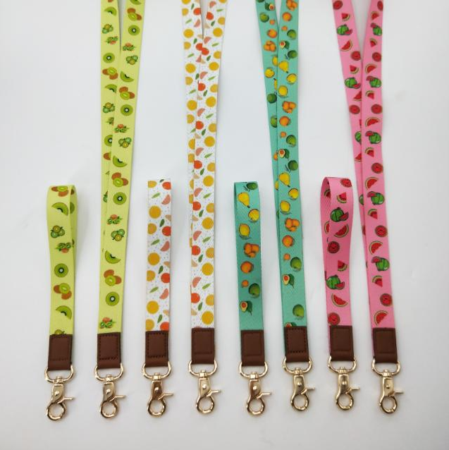

Best Logo Lanyard Designs That Make Your Brand Stand Out
2026-11-16
Let's be honest—most lanyards are forgettable. But the best logo lanyard designs do something different: they turn a simple strap into a small, wearable billboard that people actually notice. Whether you're planning an event, outfitting a team, or sending merch to clients, the right lanyard design can make your logo impossible to ignore. At DONGCHUANG, we've seen how small design choices—contrast, placement, and finish—separate the lanyards that get worn from the ones that get tossed. Here's what makes a logo lanyard design truly stand out.
Color Combinations That Do More Than Just Match Your Logo
Most brands stop at picking a palette that simply echoes the logo, but the real magic happens when color choices carry the weight of a story. Think of a deep, muted terracotta paired with a cool slate blue—neither color appears in the logo itself, yet together they evoke a sense of grounded warmth and quiet confidence that a literal match never could. This kind of pairing lets the visual identity breathe, giving every page and product shot a layered, editorial feel.
The trick is to treat color as an emotional undercurrent rather than a branding checklist. A soft sage green next to a washed-out coral can suggest freshness without feeling predictable, while a near-black plum against warm ivory reads as elegant but never stiff. These combinations work because they create tension and harmony at the same time, pulling attention toward the content instead of shouting for recognition. They make a layout feel lived-in and intentional, not assembled from a template.
When you move beyond matching the logo, you also unlock flexibility. One week the hero section might lean into dusty rose and charcoal, the next into faded denim and brass. The brand still feels cohesive because the underlying mood stays consistent—only the accents shift. That kind of range keeps a site from going stale and gives customers a reason to linger, noticing the small choices that make the experience feel crafted rather than generated.
The Feel Factor: How Material Choices Shape Brand Perception
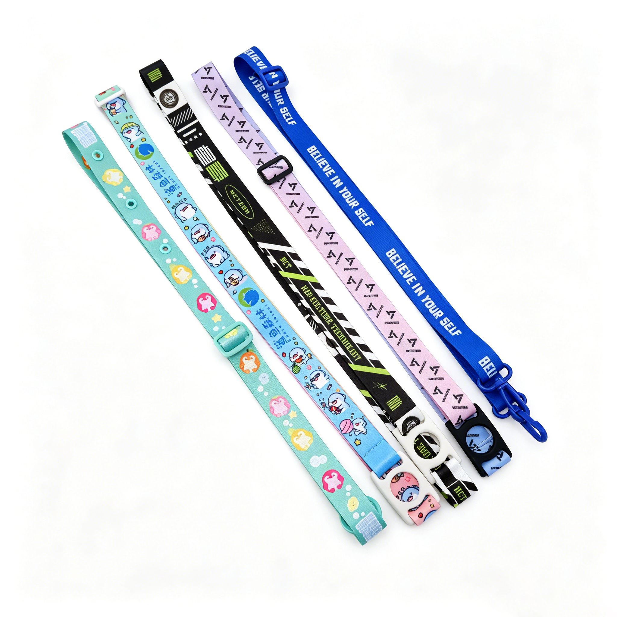
Touch is often the forgotten sense in branding, but it quietly shapes how we judge quality. A phone with a ceramic back feels different from one with glossy plastic, even before you turn it on. That difference isn’t incidental; it’s a decision a brand makes about who it wants to be.
Consider packaging. A skincare jar with a heavy glass base and a softly textured cap signals luxury without saying a word. The same cream in a thin, squeaky plastic tub might work just as well, but it doesn’t create the same pause. Brands that understand this use material weight, temperature, and surface friction to imply durability, care, or exclusivity.
This doesn’t mean expensive materials are always the answer. A rugged outdoor brand might choose matte, scratch-prone aluminum because it tells a story of use and adventure. The feel factor works when material choices align with the brand’s core promise, turning a simple touch into a quiet confirmation.
When Less Is More: Minimalist Logo Lanyards That Still Pop
Minimalist logo lanyards succeed not by shouting, but by letting the brand mark breathe. A single clean line of color, a well-chosen material like matte recycled PET, and a subtle debossed logo can do more than a crowded neon strap. The restraint signals confidence, and the lanyard becomes an accessory people actually want to keep wearing after the event.
The trick is contrast. Pair a muted body with an unexpected accent—think a thin stripe of cobalt near the clip or a printed logo just slightly off-center. Small details like rounded edges, a soft-touch finish, or a metal-free clasp give the piece a premium feel without visual clutter. In a drawer full of busy promotional gear, the quiet one often gets picked first.
Breaking the Mold: Die-Cut Lanyard Designs Worth Trying
Most lanyards look interchangeable—same width, same rounded ends, same predictable logo placement. Die-cut designs flip that expectation by letting the strap itself follow a custom outline. A coffee brand can shape the lanyard like a steaming cup, a music festival can cut it into a guitar pick, or a tech company can use a clean hexagonal profile that echoes its product design. These small contour shifts make the lanyard feel less like an afterthought and more like a deliberate part of the visual story.
The key is balancing shape with wearability. Intricate cuts may look great on a screen, but if the edges catch on clothing or the neck loop becomes uncomfortable after an hour, people will leave it in a drawer. Stick to one or two bold cut lines rather than complex lace-like patterns, and reinforce areas around the attachment hole. Softer PVC or laser-cut fabric with smooth, sealed edges tends to hold up better than raw woven polyester when there are sharp angles.
For a genuinely fresh approach, try partial die-cutting—where only the end tab or a small section of the strap takes on an unusual shape while the main neckband stays standard. You get the visual surprise without sacrificing comfort. Another route is to cut a negative-space motif: a slim horizontal slit that reveals a second color underneath, or a series of small cutouts that form a pattern when the lanyard hangs flat. These details spark conversation and give attendees a reason to keep wearing the lanyard long after the event ends.
Type That Travels: Making Your Logo Legible on the Move
A logo glued to a storefront can afford fine hairlines and delicate serifs. Put that same mark on a delivery van, a coffee cup sliding across a counter, or a runner's jersey, and those details vanish into a blur. Legibility on the move isn't about shouting louder—it's about designing for distance, speed, and unstable surfaces. Think of your logo as a signal that needs to be decoded in under a second, not a manuscript to be admired up close.
Start by stripping away anything that can't survive a quick glance. Thin strokes, tight letter spacing, and low-contrast color pairs are the first casualties when a logo starts moving. Instead, favor bold silhouettes, open counters, and a clear focal point that holds together even when slightly out of focus. Test your design by shrinking it to the size of a postage stamp or viewing it while walking past your screen—if the core idea still registers, you're on the right track.
Color and background also shift the rules. A logo that works on a white website might disappear on a tinted vehicle wrap or a busy urban backdrop. Give your mark enough contrast to survive variable lighting and motion blur, and consider a simplified one-color version for high-speed environments. The goal is not to dumb down your brand, but to make it travel without losing its identity. A legible logo is one that keeps communicating long after it leaves the page.
Tiny Details, Big Impact: Using Hardware and Accents to Stand Out
Most people overlook the tiny hardware on cabinets and drawers until something feels off. Swapping out generic builder-grade knobs for something with a bit more character—like a hand-finished bronze pull or a slim leather tab—can shift the entire mood of a room without a single coat of paint. It's the kind of detail guests notice subconsciously: the cool weight of a solid brass handle, the way a geometric backplate catches the light. You don't need a massive budget or a full renovation. Just replacing a dozen pulls in a kitchen or bathroom can make the space feel considered rather than assembled.
Accents work the same way, but they're even easier to experiment with. A single vintage ceramic bowl on a floating shelf, a row of mismatched glass knobs on a dresser, or an unexpectedly thick edge detail on a wooden side table can give a room a point of view. The trick is to avoid matching everything perfectly. Mixed metals, for instance, used to be considered a mistake—now they read as intentional when you repeat each finish at least twice. Think of a matte black hinge next to an unlacquered brass latch, or a chrome faucet paired with nickel cabinet pulls. Those small contradictions keep the eye moving and stop a space from looking like a showroom.
What really makes hardware and accents stand out is how they interact with the larger surfaces around them. A dark bronze pull against a deep green cabinet front creates a quiet contrast that feels more expensive than a glossy gold knob on white. Even something as simple as swapping standard hinges for ones with a visible ball tip or using a long bar pull instead of two small knobs can change the visual rhythm of a piece of furniture. It's about treating the small stuff as part of the design conversation, not an afterthought. When the details have a little personality, the whole room starts to feel like yours.
FAQ
Pick one thing to dominate the strip. Usually that's your logo, but it could also be a signature color or pattern. The mistake is trying to make every inch do a job. Give the main element room to breathe and the whole design looks more expensive.
Absolutely. A single logo at the chest or just below the collar line reads as confident. You can add a subtle tone-on-tone pattern pulled from part of the logo for texture, but it should stay in the background so the main mark stays sharp.
Contrast drives legibility. If your logo is dark, use a mid-tone or light background. If your logo is bright, a charcoal or navy base often lets it pop. Avoid matching the background too closely to any one logo color or the whole thing turns muddy at a distance.
Polyester with dye-sublimation keeps full-color logos crisp after months of use. For a more premium feel, woven fabric can give logos a subtle raised texture, but it works best with simple shapes. Stay away from thick tubular polyester if fine detail matters.
Not really. Wider straps give you more print area, but they can feel bulky around the neck. If your audience wears them all day, a 15mm or 20mm width often looks sleeker and still holds a clear logo. Let comfort shape the choice, not just surface area.
They act like the frame on a picture. A matte black or brushed metal swivel hook can elevate a simple fabric strip. If the hardware feels cheap or shiny, it drags down the whole impression, no matter how good the logo looks.
Cramming in too many elements—logo, tagline, website, social handle, event name—until nothing stands out. Pick a clear hierarchy: logo first, maybe one short line of text, and let everything else go. White space on a lanyard signals restraint.
Use an unexpected detail: a border in a brand color, a custom silicone logo piece instead of printed fabric, or placing the logo near the clip rather than center chest. Small departures from the usual layout make people notice it as a design choice.
Conclusion
A lanyard rarely gets the attention it deserves, yet it sits at chest height all day—making it one of the most visible brand surfaces you own. The smartest designs start with color: instead of simply matching your logo, push the palette slightly off-center. A deep navy strap with a single coral thread, or matte black paired with a warm off-white, creates a subtle tension that draws the eye without shouting. Material choice does equally heavy lifting. A tightly woven polyester reads efficient and budget-conscious, while a soft tubular or bamboo-fiber strap feels more considered and premium. Even the way light hits the texture can shift how people judge your brand before they read a single word. Minimalism works here, but only when it's deliberate—clean negative space around a compact logo can feel more confident than a busy all-over print. Pairing that restraint with one unexpected finish, like tone-on-tone embossing, keeps the design from fading into the background.
Shape and typography separate forgettable lanyards from memorable ones. Die-cut designs that trace the outline of a logo, a product silhouette, or an abstract brand mark break the standard rectangle and instantly signal that your company pays attention to detail. But a clever shape is wasted if the logo itself becomes a blur in motion. On a swaying strap, thin script fonts and fine details vanish, so the best lanyards use bold, simplified wordmarks or icons that stay readable from arm's length. The smallest hardware choices often carry the biggest brand impact: matte black swivel clips, custom-engraved buckles, colored stitch lines, or a single metal ring in your signature hue can act as a quiet signature. These accents give people something tactile to remember, turning a practical item into a small piece of brand storytelling. When all these elements work together—color, material, form, type, and hardware—the lanyard stops being a throwaway accessory and becomes a walking extension of your visual identity.
Contact Us
Contact Person: Bill Huang
Email: [email protected]
Tel/WhatsApp: 8613829102720
Website: https://www.dclanyard.com