
Kraft Paper Box Original Manufacturer Explains How Custom Packaging Elevates Brand Identity
2026-11-17
Custom packaging rarely gets the credit it deserves—most brands treat the box as an afterthought. But Kuaijie Carton sees kraft paper boxes differently: they are a quiet, tactile handshake with your customer before the product is even seen. In this guide, the original manufacturer explains how the right structure, print, and finish turn plain kraft into a memorable brand statement, not just a shipping container.
The Box Is the First Handshake Your Brand Makes
The moment a parcel lands in someone's hands, the conversation has already begun. The outer carton, the tape, the weight of it, even the way the label sits against the grain of the board—these details register before any product is revealed. A box that feels sturdy and considered tells the customer they made a good decision before the flap is lifted.
Most brands treat packaging as protection. But the ones people remember treat it as introduction. A slightly textured wrap, a color that doesn't try too hard, a message printed small on the inside of the lid—these are the quiet signals that say this wasn't packed by a machine and forgotten. The unboxing becomes less about tearing through layers and more about being welcomed.
If the box is the first handshake, it should not be a limp grip or an overeager squeeze. It should be firm, warm, and brief enough to leave a mark. Every fold and insert is a chance to say, “We thought about you before we ever knew your name.” That impression travels further than any product tagline ever will.
Why a Kraft Box Manufacturer Can Spot an Afterthought
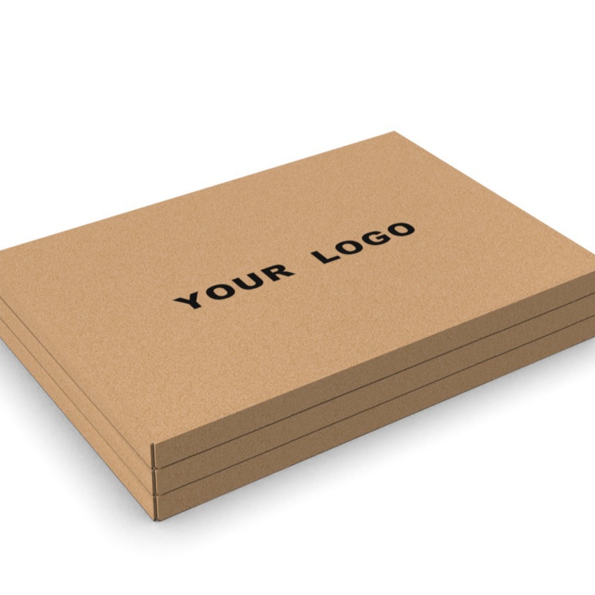
When a packaging design is treated as a final step rather than a core part of the product story, a seasoned kraft box maker notices within seconds. The telltale signs are subtle but unmistakable: a logo squeezed into a corner with no breathing room, a color palette that fights the natural brown tone instead of working with it, or a window cutout placed where the product's best angle never actually lines up. These aren't random mistakes. They happen when someone asks for a box at the last minute and expects the manufacturing process to magically fix what the design never considered.
What makes an afterthought obvious to a producer of kraft packaging is the lack of conversation between form, material, and user experience. A well-integrated design allows the kraft surface to participate—its texture, its smell, its slight give under pressure. But when the box is an afterthought, the material becomes just a carrier. You'll see generic flaps that don't match the product's weight, or a closure that requires three extra tape strips because nobody tested how the box would actually travel. The manufacturer can spot the missed dialogue because they spend years seeing both extremes: boxes that feel like part of the product, and boxes that feel like an apology.
The deeper clue often comes from how the box handles the unboxing moment. A kraft box that was genuinely considered from the start reveals a sequence—a natural pause when the lid lifts, the product resting at the right height, maybe a small note printed inside the flap. An afterthought lacks that rhythm. It's just four walls and a bottom, printed and folded to spec, with no thought given to what human hands do next. The best kraft box manufacturers don't need to hear the client admit the deadline was too tight; they can read it in the box's silence.
Custom Cutouts and Inserts That Slow the Reveal Down
The joy of a well-crafted package often lies in the delay between seeing the outer layer and reaching what's inside. Cutouts and inserts serve that purpose quietly, creating small moments of friction that make the experience feel more intentional. A die-cut window doesn't have to expose everything at once; instead, it can frame a detail, hint at a texture, or let a color bleed through without giving the whole story away. Paired with a soft insert that shifts slightly as the box opens, the reveal becomes a sequence rather than a single instant.
Inserts do more than keep an item from rattling around. They can be shaped to hold the product at a slight angle, so the first thing you see is a shadow or a curve rather than the entire object. Layering tissue, cardstock, or molded pulp behind a cutout adds depth, turning a simple opening into a slow, tactile discovery. The material choices matter here: a matte board against a glossy printed layer can guide the eye exactly where the designer wants it to go, without resorting to flashy graphics.
What makes this approach feel human is its restraint. There's no rush to show everything at once, and that restraint invites the recipient to pause, tilt the package, and look a little closer. Whether it's a crescent-shaped opening that reveals a sliver of product or an insert that lifts the item up as the lid comes off, these details work because they respect the moment. The result is a package that doesn't shout for attention but lingers in memory long after the box is open.
How Texture and Print Turn Kraft Board into Brand Voice
Kraft board rarely gets credit for being loud. Its surface is naturally muted, almost shy, with flecks and fibers that catch light in uneven ways. But once texture is pressed into that surface and ink is laid down with intention, the material stops being a neutral carrier and starts speaking. A debossed logo can feel like a handshake; a coarse, uncoated area next to a glossy printed band creates a rhythm that makes people slow down and run a thumb across the box. That physical pause is where brand voice actually registers.
Print choices do more than decorate the board. They suggest tone. Matte black on raw kraft reads as direct and slightly rugged, while a single-hit pastel ink can make the same sheet feel playful or gentle. When the grain is allowed to break through the ink instead of being buried under coatings, the final piece carries an honesty that polished stock rarely achieves. It is not about shouting a message. It is about matching the way a brand would speak if it were standing in the room.
The most effective combinations treat texture as punctuation. A raised logo, a blind emboss, or a slightly misregistered screen print can add hesitation, emphasis, or warmth without adding a single word. That is what turns kraft board from a budget substrate into a deliberate voice: the customer may not articulate why the package feels trustworthy, but their hand already knows.
Why Customers Keep the Box After the Product Is Gone
The box often stops being packaging and becomes part of the purchase. Some boxes feel too well-made to throw away—rigid corners, soft-touch finishes, a magnetic flap that closes with a quiet thump. Even after the actual item is gone, that box still suggests care, and keeping it can feel like holding onto a small piece of the experience.
Sentiment gets tangled up with it too. A phone box might hold a handwritten note or a warranty card, but also the memory of unwrapping something long awaited. Tossing the box can feel like admitting the moment is over. So it sits on a shelf or in a drawer, not because it's useful, but because it carries a feeling.
Then there's the practical-ish excuse. People promise themselves the box will organize cables, store letters, or protect something fragile later. Sometimes it does. Often it just waits. But that "might need it later" thought gives permission to keep a small piece of packaging that was never really just packaging.
The Last Fold Is Where Brand Identity Becomes Tangible
Most people never notice the final fold until it goes wrong. A cheap snap, a cracked edge, a panel that refuses to lie flat—those flaws register immediately, even if nobody can name them. When that fold is treated with real attention, though, it stops being a production afterthought. It becomes the moment a flat sheet assumes a physical posture and the brand starts behaving like a thing rather than an image.
That last crease also sets the pace. It determines which panels meet the hand first, where the eye is allowed to pause, and how much pressure the piece carries before it opens. A narrow fold on soft stock can make an identity feel intimate; a wide scored hinge on a rigid cover can make the same set of words feel architectural. These choices rarely appear in a brand manual, yet they shape the encounter more than another adjusted logo lockup ever will.
What makes the last fold matter is that it leaves evidence of the brand’s standards. The way paper remembers a crease, the way the piece closes with a slight lift or settles flat, the sound it makes when handled—all of it reads as part of the identity. Once that fold is designed rather than defaulted, the final piece no longer just announces the brand. It holds it.
FAQ
The material is felt before the logo is read. Kraft board has a warm, fibrous surface that suggests honesty and sustainability. When a brand uses it deliberately, the packaging already communicates values like simplicity and care, so the logo becomes reinforcement rather than the only message.
Beyond printing, things like board thickness, fluting, soft-touch coatings, embossed logos, custom inserts, and tear strips change the physical experience. A heavier box with a cloth pull tab feels more premium than a thin mailer, even if the outer design is minimal.
Yes, many manufacturers now offer short runs with digital printing or plate-free finishing. Small brands can start with one standard size and add a custom stamp or label, then move to fully printed boxes as order volume grows. It is less about scale and more about design consistency.
Ink sits differently because the surface is less coated. Colors can look softer and earthier, and bright whites usually need a white underprint if a brand wants them to pop. A designer should work with the brown tone instead of against it, using contrast rather than fighting the background.
Packaging shapes the moment a customer opens the box, and that moment sticks. If the box is hard to open, flimsy, or feels wasteful, people notice. If it opens cleanly and the product is presented well, it adds perceived value that makes the next purchase feel worth the price.
Internal printing is a big one. Most brands only decorate the outside, but printing a short message or pattern inside the lid costs little and changes the opening moment. Also, matching void fill to the kraft material, like crinkle paper instead of plastic bubbles, keeps the experience consistent.
A good manufacturer asks about product weight, shipping method, storage conditions, and target customer before suggesting sizes and materials. They might recommend a foldable design to cut freight costs or a coated kraft finish for cold-chain products. That practical input shapes identity as much as colors and fonts.
Intentional packaging has a sequence: outer protection, a clean opening, a note or insert, and the product secured without excessive tape. When each step is easy and the materials match the brand's tone, the customer feels the company planned the delivery, not just threw items into a box.
Conclusion
A kraft box rarely gets credit for the work it does before a product is even touched. From the maker’s floor, that first lift of the lid reads like a handshake: the weight of the board, the resistance of the fold, the way a custom cutout frames the item instead of just holding it. When inserts slow the reveal down, unboxing stops being a transaction and starts feeling like a small ritual. It is the kind of detail a box manufacturer notices because generic packaging always rushes through the moment, while thoughtful packaging gives the customer time to settle into the experience. That pause is where the brand begins to feel intentional rather than accidental.
Texture and print turn ordinary kraft board into something closer to a voice. A blind deboss, a muted ink, or a deliberately rough edge can say more about a label than another glossy slogan. The real test comes later, when the product is gone and the box remains on a shelf, storing letters, cables, or loose buttons. That is not waste; it is the brand staying in the room. By the time the last fold is tucked, identity is no longer abstract—it sits in someone’s hands, with the maker’s choices still quietly doing their job. A box that survives the product has already earned a longer relationship.
Contact Us
Contact Person: Tan Xiang
Email: [email protected]
Tel/WhatsApp: 8613798906863
Website: https://www.dgkjzx.com